
AIRLOOM
A mobile app to keep memories alive so your presence can always be felt.
We all have a story that deserves to be passed on. However, there isn’t a single comprehensive resource to ensure this happens, until now.
Airloom is a mobile app that enables individuals to share precious memories with their loved ones, now and in the future.

Design Thinking Process
Empathize
Define
Ideation / Wireframing
High-Fidelity Prototype
Usability Testing
Project Specifications
This mobile app is a personal project tackling loss and the support we could only hope to provide to our loved ones in their time of need.
Duration 4 Weeks
My Roles
User Experience (UX) Designer
UX Strategy
Interaction (IxD) Designer
User Interface (UI) Designer
UX Researcher
Tools
Figma / FigJam
Notion
Google Meet
Dovetail
Photoshop
Illustrator
PROBLEM
CAN WE EASILY KEEP MEMORIES ALIVE, FOREVER?
We all have a story that deserves to be passed on, and more importantly, loved ones that deserve to feel close to us when we’re gone.
The desire to capture and share that story with impact is strong, but there isn’t enough time in our busy schedules to prioritize it when it matters, now.
STRATEGY
LOOKING FORWARD
Today’s memories become tomorrow’s history.
This app would be an ideal partnership with companies that focus on family history, like Ancestry.com.
They currently look back to answer today’s questions, but a complementary mission would encourage looking forward, anticipating the questions of tomorrow, and capturing the answers today, from the source.

HYPOTHESIS
LOSS AND PROGENY
Parents want to pass on memories to future generations as a result of not receiving enough family memories from past generations.
Having dealt with loss, and wanting a better experience for their children, creates a powerful motivator for action.
EMPATHIZE
Parents want an easy and impactful way to pass on memories.
See the research results below.
USER INTERVIEWS
PROBLEM FINDING
Conducted interviews with 6 participants
Ages 28 - 50
All participants are parents that have dealt with the loss of someone close to them
Topics discussed were:
Reflecting on shared memories from past generations
The mindset of sharing memories with future generations (their children)
How to successfully reconcile the past with the future process
KEY INSIGHTS
PARENTS WANT TO DO MORE BUT DON’T HAVE ENOUGH TIME
“It only gets busier and it's figuring out how to juggle everything.”
Everyone expressed a desire to capture and share memories with their kids but very clearly said it’s hard to make time for it since their lives are hectic.
“Oh man, it would mean a lot to see moments that you haven't seen before. It kind of brings 'em back to life in a way.”
Video messages from loved ones after their death was the most impactful topic discussed. Everyone was overwhelmed wishing that existed for them and imagining what it would be like for their loved ones.
“We've become digital hoarders, I've got 60,000 pictures, but they exist on my phone and nobody's ever gonna look through them.”
Memories needed to be well organized and easily filtered to motivate them to add to and engage with the product.
DEFINE
How might we help parents keep today’s memories alive, so their presence can always be felt?
IDEATION
PROPOSED SOLUTION

Quick + Easy
With busy schedules, parents need an easy way to make an impact in the shortest time possible.

Future Messages
By far, the most impactful desire was to see a video message of a loved one, well after their death. Enter Future Messages.

Support Engagement
The desire is strong, but it’s hard to remember to do it. Reminders with prompts would help increase engagement.

Well Organized
Aimlessly looking through 50,000 photos and videos is overwhelming. There has to be a way to filter and sort with purpose.
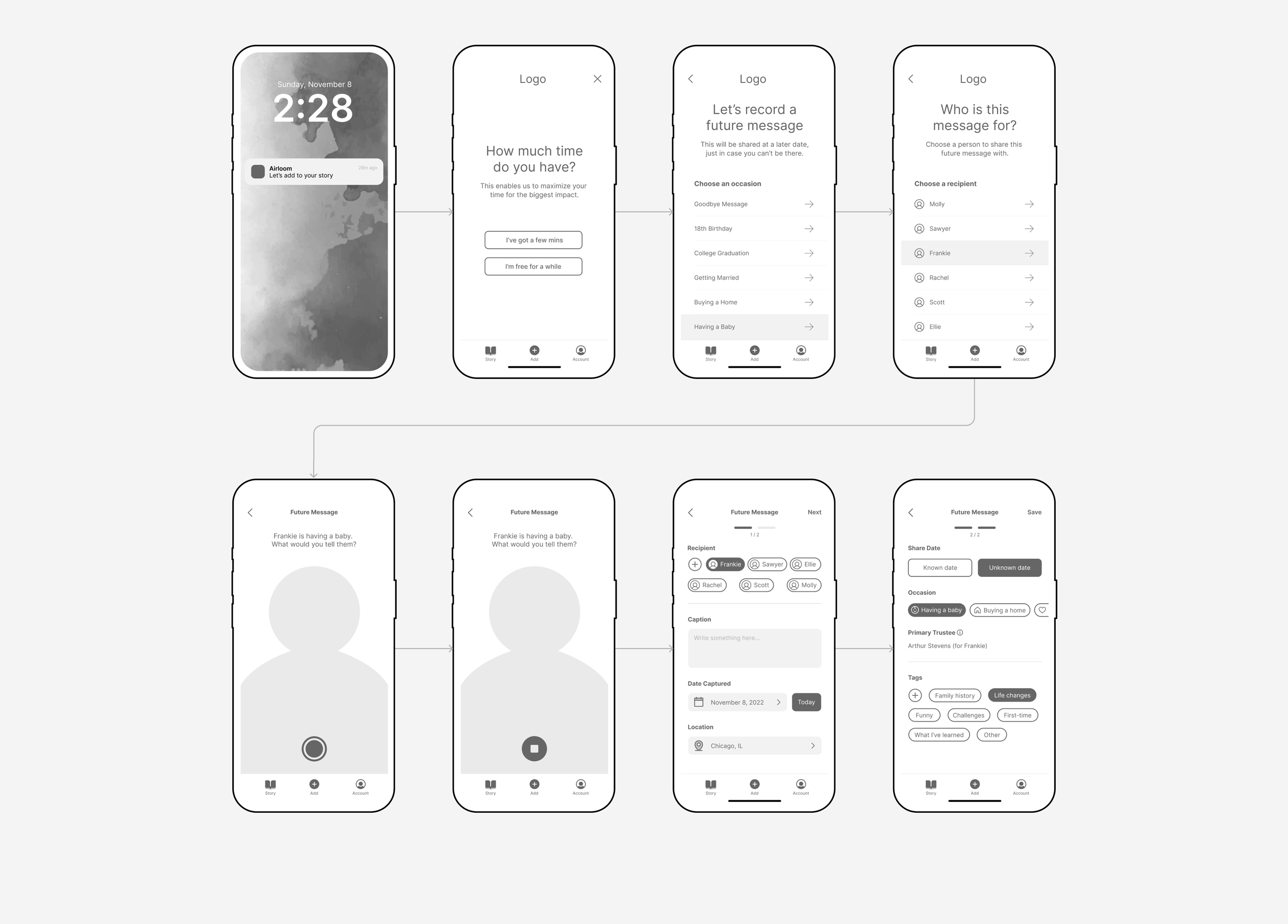
KEY FEATURE
Future Messages are to be shared at a later date, just in case you can’t be there.
WIREFRAMING - LOW-FIDELITY
PEN TO PAPER
Specific task flows were focused on to break down the process and think through a busy parent’s needs. Below are the displaying applied filters and the save settings iterations with the help of continuous outside feedback.
Potential applied filter designs were selected based on feedback
Some of the designs pushed too far beyond familiar patterns, but quick access to the applied filters was also desired.
The ideal number of screens for the save settings was tested
Too many screens was time-consuming but one long screen to scroll was a lot to take in.
Also having a screen (third one) that only has optional tasks creates an unnecessary step.
Two steps were preferred
2 screens was the right balance to provide less to do at once without having too many overall steps.
The required tasks were prioritized at the top with the optional tasks below.
(Opens Figma in a new window)
WIREFRAMING - MID-FIDELITY
DIGITIZED DESIGNS
Stepping up the fidelity provided some challenges to work through like maintaining simplicity with instructions and tasks, testing copy throughout, and breaking down the most ambiguous case of future messages being delivered on an unknown date.
(Opens Figma in a new window)
BRAND IDENTITY
AESTHETIC CONSISTENCY
Establishing a visual standard is crucial to maintain consistency across the design and to support the transition into development.
Logo
Color
Fuchsia is cheerful, uplifting, and celebratory. This is meant to contrast the reality of death.
Also being Airloom captures memories digitally, fuchsia represents the light spectrum (ROY G BIV) by combining the first color, red and the last, violet.

Typography

Iconography
WIREFRAMING - HIGH-FIDELITY
BRINGING IT ALL TOGETHER
Incorporating the branding and design system, the UI takes on a personality of its own which directly impacts the feeling a parent has while using the app.
Record a New Future Message (Prompt)
Edit a Memory (Caption)
Filter Memories
Watch a Specific Video
Displayed hi-fi wireframes are post iteration. See usability test results below for the initial design.
HIGH-FIDELITY PROTOTYPE
IT’S (SORT OF) ALIVE
This high-fidelity prototype provided the means for a most crucial step, usability testing.
Tasks performed during usability testing
Record and save a Future Message
• Open the app via the notification
• Record a future message for Frankie for when she decides to grow her family
• Save the video
Edit a memory (Future Message)
• You changed your mind and decided to add a caption to the video you just recorded
Filter memories
• Check how many future video messages you’ve recorded for Sawyer
Filter and watch
• It’s been a tough day and you need a good laugh… find funny videos you’ve uploaded
Displayed prototype is post iteration. See below for usability test results.
USABILITY TESTING
MEASURING SUCCESS
While perfection is something to strive for, incremental improvements are the key to success and usability testing is the road to getting there.
Below are the prioritization list iterations with the most impactful changes.
Add Your Own Occasion
Adding a new occasion on the same screen was preferred to exiting the flow.
The capability to add a new occasion can now be added in 3 simple taps.
Watch After Recording
After recording a new video, test participants wanted to watch it to see if they were happy with it. For v1 when stopping a recording it went directly to the save screen
A new task flow was added to watch and re-record a video before saving it.
Filter AND Sort
Participants wanted to be able to filter and sort the way their memories were displayed.
A sort option was added to have more visual control over the organization of the memories.
Applied Filters
The horizontal scroll created a risk for participants to accidentally close the applied filters.
The new design removes the horizontal scroll, allows for the applied filters to be edited without clearing all, and still provides visibility of the applied filters using Haptic Touch.
IMPACT
KEY METRICS
These designs have not been implemented yet and therefore there are no metrics to track the real-world impact of the app. Below are some key metrics that would be beneficial to track if there was data to analyze.
Adoption
Sign-ups for the app as new products need to grow an initial user base.
Reviews
Positive reviews from users to validate the purpose and effectiveness.
Value
Referrals from existing users that convert to new sign-ups.
Retention
Deactivations vs retention of existing accounts.
FUTURE RELEASE
DIDN’T MAKE THE LIST

Shorter Term
Quick add feature brings you to the camera when opening the app
Periodic review of future messages in case it’s preferred to re-record them
Add to an existing future message, rather than have to re-record the entire message
Save recently deleted memories for 30 days that can be restored
Bulk select to delete multiple memories
Deeper story topics to share family history, reflections and specific experiences

Longer Term
Automatically make a video of memories based on a period of time
Trim videos and edit photos
AI to organize content with facial recognition, sound of voice, etc
AI to select the best photo from upload of duplicates
3D scan of physical keepsakes just in case
TAKEAWAY
LESSONS LEARNED
Research shows that people pull away from products that deal with heavy topics like loss and death so it’s crucial to be careful about how the product is positioned.
Solution:
Everything from the name and branding to the UI copy and marketing needs to align with the purpose in a positive light. In this case, dealing with death was framed as ensuring your presence is always felt.
A product is as much about what it can do for a user as it is about how it makes them feel, so it needs to go beyond the UI/UX design.
Solution:
Passionately telling a story connects with an audience, especially when they identify with the story (we’ve all experienced loss).
Follow design patterns, but don’t let that stop you from pushing the limits.
Solution:
When solving a problem for a user, utilize design patterns that are consistent and familiar so they instantly feel comfortable using the product. But each scenario requires its own solution so explore many options and utilize usability testing to confirm it works (or doesn’t).