
CALENDLY FRIENDS
Reimage Calendly’s website for making social plans.
Making plans can be a time-consuming process, going back and forth to choose a date, time, and activity.
This mobile-first responsive website enables individuals to make plans with a friend in a single interaction.
Design Thinking Process
Empathize
Define
Ideation / Wireframing
High-Fidelity Prototype
Usability Testing
Project Specifications
This student project is a hypothetical re-design of Calendly’s website to make social plans. It’s a mobile-first responsive website.
Duration 4 Weeks
My Roles
User Experience (UX) Designer
UX Strategy
Interaction (IxD) Designer
User Interface (UI) Designer
UX Researcher
Tools
Figma / FigJam
Notion
Google Meet
Dovetail
Photoshop
Illustrator
PROBLEM
CAN WE JUST SKIP TO THE FUN PART?
Making plans with friends can be a negative experience that is put off due to the time-consuming process of coordinating a date, time, and activity that works for all parties.
85% of respondents go back and forth at least 3 times.
STRATEGY
THERE ARE 24 HOURS IN A DAY
Calendly has simplified business scheduling for more than 10,000,000 users worldwide.
However, over 75% of the week is outside traditional business hours.
This untapped market creates a major opportunity to leverage existing business users for additional engagement AND capture a new audience for social plans to grow their user base with a modified platform.

HYPOTHESIS
LESS BACK AND FORTH
A more efficient way to schedule social plans would require a reduction in the number of interactions.
EMPATHIZE
Making social plans can be a
time-consuming process.
See the research results below.
SURVEYS
PROBLEM FINDING
Results include responses from 40 participants
Ages 18 - 55
All participants make social plans at least once a month
Topics asked about:
Process of making social plans
Difficulties to confirm social plans
Frequency of making social plans


KEY INSIGHTS
INDIVIDUALS SPEND TOO MUCH TIME MAKING SOCIAL PLANS

Only 38% describe picking a day and time as “easy”.
The process for picking a day and time could be improved for a majority of people.

75% describe their least favorite part as choosing a date/time or activity.
A tool that streamlined the what, when, and where would improve the experience of making plans for most people.

63% of respondents make plans at least once per week.
Making plans with friends is a frequent occurrence and shows a potential demand for the service.
DEFINE
How might we make scheduling social plans more efficient for busy individuals?
IDEATION
PROPOSED SOLUTION

Prioritize Availability
The first action is to select “when” because suggested activities will be dependent on the time of day.

Activity + Location
Providing time-relevant suggestions for a specified location will increase the likelihood of agreeing on an activity.

No Calendar View
90% of respondents make plans within a week so the design needs to reflect an ideal interaction for that limited window.

Easy Access
An ability to easily switch between business and personal scheduling is needed for customers that use both services.
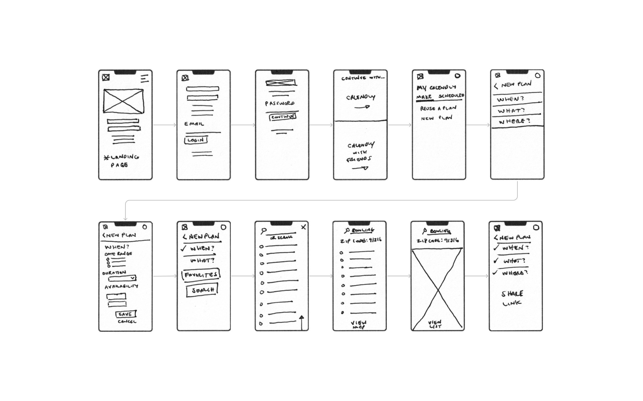
WIREFRAMING - LOW-FIDELITY
PEN TO PAPER
Calendly excels with simplified scheduling for (consistent) business hours, but what about the less predictable needs of social planning? The mindset of social planners requires a modified process to enable them to achieve their goals.
Also, the where and what has commonly become remote video calls for Calendly, so meeting in a physical location, and choosing an activity poses an added challenge in determining viable options for that time of day.
(Opens Figma in a new window)
WIREFRAMING - MID-FIDELITY
DIGITIZED DESIGNS
Exploring the low-fidelity designs in greater detail brought out a number of challenges. For instance, how could someone quickly and easily find suggested activities in a given area in the shortest number of steps? The attempted answer began with a zip code and quickly changed to two options - an address or a map for greater flexibility.
(Opens Figma in a new window)

WIREFRAMING - HIGH-FIDELITY
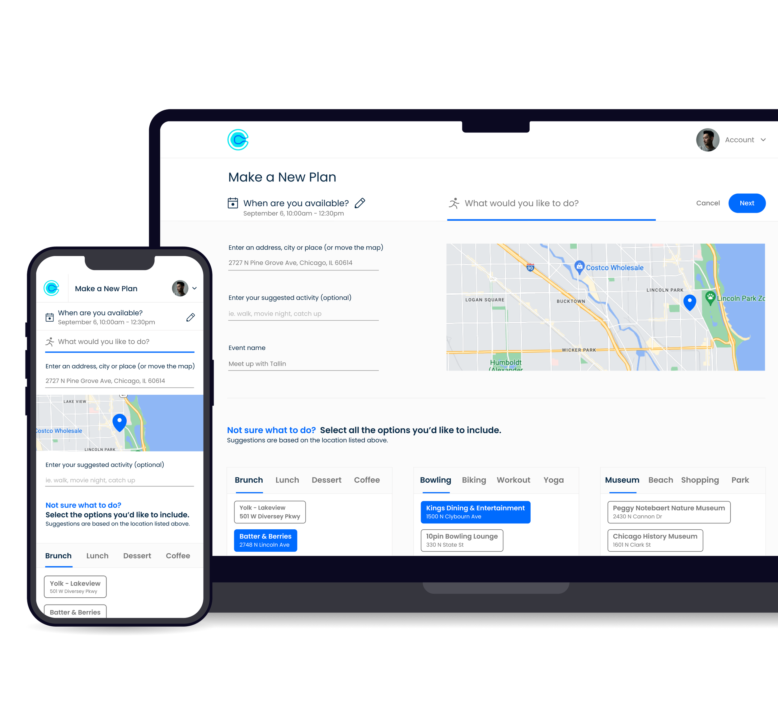
THE SAME, BUT DIFFERENT
Calendly Friends is a parallel product to Calendly, so they need to have a consistent feel while being clear they are distinct services.
The Initiator Selecting Available Times
The Initiator Suggesting Activities
The Recipient
Displayed hi-fi wireframes are post iteration. See usability test results below for the initial design.
WIREFRAMING - RESPONSIVE DESKTOP
FLEXIBILITY ON ALL FRONTS
A mobile-first approach was taken since 85% of respondents currently use text to coordinate plans. Knowing that current business customers may utilize a desktop computer more often, the designs were made responsive to accommodate all users.
Selecting Available Times
Suggesting Activities
Recipient View
Displayed hi-fi wireframes are post iteration. See usability test results below for the initial design.
HIGH-FIDELITY PROTOTYPE
IT’S (SORT OF) ALIVE
This high-fidelity prototype provided the means for a most crucial step, usability testing.
Tasks performed during usability testing
The initiator selects available times
• Enter Calendly Friends
• Make new plans
• Select an available date
• Select available times
The Initiator selects activities
• Select suggested activities based on their current location (default)
The Initiator makes changes
• Select suggested activities based on a new location
The Recipient
• Review the options provided
• Select the preferred when, what and where
• Confirm plans
Displayed prototype is post iteration. See below for usability test results.
USABILITY TESTING
MEASURING SUCCESS
While perfection is something to strive for, incremental improvements are the key to success and usability testing is the road to getting there.
Below are the prioritization list iterations with the most impactful changes.
Reorganizing the Header
The ability to switch between social plans and business meetings was not needed during social scheduling.
Therefore the “Friends” dropdown was limited to the home screen, which also helped condense the page when choosing an activity.
Current Step Notation
The blue bar notating the current step was too dominant and felt like a CTA button.
A blue line that didn’t extend to the edges was used to make the separation more fluid.
Copy Changes
Larger blocks of text were not read, and helpful information was missed.
Copy adjustments were made, including reducing the length of the “Not sure what to do” paragraph to be more concise.
Clarifying Buttons
The placement and design of the view new suggestions button were too ambiguous.
It was moved to the bottom of the list and text was added for clarity.
Recipient Preferred Text
The recipient preferred to have the option to receive a confirmation via text.
While text and email options were included, text was prioritized due to the majority of users on mobile devices.
IMPACT
KEY METRICS
Being this was a student project, the designs were not implemented and therefore there are no metrics to track the real-world impact of the service. Below are some key metrics that would be beneficial to track if there was data to analyze.
Adoption
Increased number of sign-ups for the Calendly Friends service (above the flagship business service).
ROI & Conversion
Increased visibility for the new service via call-to-action with existing users (leveraging business users with limited advertising to increase profits).
Revenue
Additional income from sponsored suggested activities.
FUTURE RELEASE
DIDN’T MAKE THE LIST

The Initiator Side
Sync the initiator’s calendar to skip the when step and provide more comprehensive availability options for the recipient.
See pins on the map for where selected suggestions are in relation to each other and relative to the preferred location
A larger (expandable) map to more easily explore options based on proximity
Details about the suggested activities (ie. hours, location, reviews)
Select a first choice for the suggested activities in case the recipient doesn’t have a preference. The recipient would check a box to select the initiator’s first choice.

The Recipient Side
Additional options for availability ( initiator’s synced calendar)
See where activities are on a map before making a selection
TAKEAWAY
LESSONS LEARNED
Two unique groups of users can use the same product differently for the same desired outcome.
Solution:
The context of a user is as important as the desired outcome. Scheduling for a business setting is very different than scheduling for a social setting so ideating on the different mindsets of the user is crucial.
Leveraging outside resources to reduce the number of steps is ideal to optimize the user experience.
Solution:
Using a synced calendar for the initiator would increase the options and flexibility of the recipient. This would also minimize the number of interactions needed to ensure a single step for each side in more cases.
Solving for a broad audience is challenging and can provide inconsistent feedback.
Solution:
On the user side, consider not only the number of users that provide consistent feedback but also the importance and relevance of the feedback as it relates to the overall product experience. Prioritizing the most impactful changes first is the best path forward.