
DIRECTIONS IN TARGET
In-store AR navigation feature
Shoppers struggle to find items at Target due to different store layouts, poor signage and non-routine purchases.
This mobile app feature enables any shopper to effortlessly find any item, in any Target store.
It can navigate to a single item or create an efficient route through the store for the items on a shopper’s list.
Design Thinking Process
Empathize
Define
Ideation / Wireframing
High-Fidelity Prototype
Usability Testing
Project Specifications
This student project is a hypothetical design for a new feature in the Target app.
Duration 4 Weeks
My Roles
User Experience (UX) Designer
UX Strategy
Interaction (IxD) Designer
User Interface (UI) Designer
UX Researcher
Tools
Figma / FigJam
Notion
Google Meet
Dovetail
Photoshop
Illustrator

PROBLEM
WHERE IS THE ITEM I NEED?
Being familiar with the location of routine items at a specific Target store is the experience all shoppers should be afforded, all the time.
Occasional purchases, last-minute needs, time constraints, and different store sizes and layouts (they are not all the same) are some of the many reasons it can be challenging to find specific items while shopping in-store.
STRATEGY
In 2017 Target announced a $7B investment to increase future growth which included improving the in-store experience.
Looking forward to more in-store shoppers post-pandemic, Target wants to increase app usage, reduce (subsidized) shipping costs from their bottom line, and provide a better in-store experience for their customers.
IN-STORE EXPERIENCE

HYPOTHESIS
EFFICIENCY
Target shoppers want a better way to find items more easily in-store.
EMPATHIZE
Shoppers struggle to find items while shopping in-store.
See the research results below.
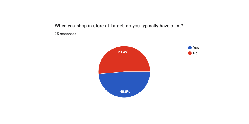
SURVEYS
PROBLEM FINDING
Results include responses from 35 participants
Ages 18 - 55
All participants have shopped in-store at Target within the last 12 months
Topics asked about:
Shopping habits in the store
Success finding items they need
Seeking out staff assistance


USER INTERVIEWS
DIGGING DEEPER
Quantitative data was not as conclusive as desired, so qualitative research was conducted.
Conducted interviews with 6 participants
Ages 26 - 42
All participants have shopped in-store at Target within the last 12 months
Topics discussed were:
Navigating stores in various scenarios
Spending more time shopping in-store than intended
Frequency and experiences with Target staff
KEY INSIGHTS
SHOPPERS STRUGGLE TO FIND ITEMS AT TARGET

“I'll just keep going back and forth to see where it's actually located.”
Most expressed familiarity with the stores but EVERY participant had stories that contradicted these statements where they could not find items when asked more detailed questions.

“I often get lost so it would be really helpful if there were more signs.”
Everyone said they spent more time than planned in the store. A majority of the reasons were due to difficulty finding specific items because of different store layouts, poor signage, and non-routine purchases.

“And finally, I just had to go ask someone, ‘where is this item?’”
Asking for help typically involved looking for a specific item or inquiring if it’s in stock.
DEFINE
How might we enable any shopper to effortlessly find any item in any Target store?
SECONDARY RESEARCH
ARE COMPETITORS DOING ENOUGH? (NO)
Walmart
A map view of the store to see where items are located.
What’s missing? Integration with a list for a personalized experience.
Kroger
A store map with the location of items on a shopper’s list.
What’s missing? Navigation to each item and an ideal route through the store.
IDEATION
PROPOSED SOLUTION

A seamless feature built off the list that guides shoppers directly to their needed item.
There’s no confusion or need to determine where to go, just follow the on-screen AR directions.

Have a list? The directions will automatically provide an efficient route through the store.
Leveraging existing list sort options, shoppers won’t have to figure out an ideal order to collect their items.

Easily request help from Target staff members, directly to your location.
Get help with the push of a button and wait there, or keep shopping.

Seamlessly utilize Target’s various fulfillment options without leaving the directions.
Out of stock items can be switched to shipping so you can move on to the next item.
TARGET APP TODAY
EXISTING SUPPORT
This functionality in the existing Target app will be built upon to support the new feature to minimize time and effort (cost).
Shopping List
Create a list of items needed for the next trip to the store.
Smart Sort
Organize the list to be collected in an efficient order.
Store Map
Store map that integrates with the shopping list.
WIREFRAMING - LOW-FIDELITY
PEN TO PAPER
Low-fidelity wireframes initiated the process of thinking through the layout with the intended functionality.
It also provided the opportunity to start visualizing how and where the feature would integrate with the existing app.
(Opens Figma in a new window)

WIREFRAMING - MID-FIDELITY
DIGITIZED DESIGNS
Further exploration was done with mid-fidelity wireframes to confront the challenges of a shopper.
Their needs and mental models discovered during the interviews were continually confronted while working through this phase in conjunction with the needs of the existing Target app.
(Opens Figma in a new window)

VISUAL DESIGN
UI BUILDING BLOCKS
The new feature was able to utilize existing components, but new UI elements were required to fill in the gaps. Maintaining the look and feel of the existing app was crucial to making the feature feel like it was always there.

Current Icons

New Icons
Current Map
The current map only shows the aisle number, so shoppers need to go back to the list to know which item each marker refers to.
Updated Map
The item’s photo is added to the aisle number on the map, providing the shopper with all the needed information.
Wayfinding Graphics
Leading up to a turn
Click for a larger view
Approaching an item (VLOS)
Click for a larger view
WIREFRAMING - HIGH-FIDELITY
SEAMLESS INTEGRATION
High-fidelity wireframes focused on connecting the feature’s newly added functionality with the design constraints of the existing app to ensure consistency and familiarity for users. These included colors, typography, iconography, copy, components, photos, and layouts.
AR Navigation to an Item
Asking for Help
More Options for Out of Stock Items
Displayed hi-fi wireframes are post iteration. See usability test results below for the initial design.
HIGH-FIDELITY PROTOTYPE
IT’S (SORT OF) ALIVE
This high-fidelity prototype provided users with the most realistic experience of the feature to date. This was used to reveal challenges a user may experience with the existing design/prototype.
Tasks performed during usability testing
Start shopping
• Navigate to the list
• Pull up the directions
• Collect the first item on the list
Out of stock
• The next item is not on the shelf
• Ask for help
• Staff confirmed the item is out of stock
• Get the item shipped instead
Unavailable staff
• The next item is not on the shelf
• Ask for help
• Target staff is unavailable
• Save the item for later
Use the map
• Check where the rest of the items are in the store (via the map)
Displayed prototype is post iteration. See below for usability test results.
USABILITY TESTING
MEASURING SUCCESS
While perfection is something to strive for, incremental improvements are the key to success and usability testing is the road to getting there.
Below are the prioritization list iterations with the most impactful changes.
More Options Button
The more options (3 dots) button was not found by participants due to the center justified positioning. Additionally, they didn’t view it as a product-level button (intention) but instead thought it applied to the entire list.
All users preferred the icon be moved to the side and the first item to be distinct so it’s clear the button only applies to the top item.
Original Design
Updated Design
Help Options Copy
The options when asking for help were not clear for a majority of participants.
Most preferred more clarity with the copy so the choice could be better understood.
Notification with Updates
The notification after requesting help didn’t provide enough clarity while waiting for assistance.
Participants wanted to be kept apprised with more updates while they waited.

Expanded View of List
The scrollable list was helpful while looking for one item at a time, but the option to see more was desired.
All participants wanted the ability to drag the list up for an expanded list view.
Walkthru of the New Feature
Quick pointers for the new feature would be helpful to make sure shoppers understand the basics.
All participants wanted a brief walkthru of the new feature.
IMPACT
KEY METRICS
Being this was a student project, the designs were not implemented and therefore there are no metrics to track the real-world impact of the feature. Below are some key metrics that would be beneficial to track if there was data to analyze.
Adoption
Increased sign-ups for the app (based on research, there is a lot of room for growth).
Stickiness
Increased usage, both frequency and time spent engaging with the app.
Bottomline
Reduced shipping costs absorbed by Target due to an increase in in-store shopping.
Currently, the shipping cost is covered by Target with a $35 min order and subsidized beyond the $5.99 shipping cost passed onto customers for lower order totals.
FUTURE RELEASE
DIDN’T MAKE THE LIST

Shopper Focused
A sort option to place perishables at the end, while still utilizing the Smart Sort method for an efficient route through the store.
Include an interactive path on the map to the remaining items for an alternate view. A step further would be to have the AR view and map view seamlessly transition based on the phone’s position.
Additional help options to report a spill, notate an item that is out of stock, or other common issues.
When asking for staff assistance through the app, provide an upfront estimate of how long it will take for staff to arrive so shoppers can decide to wait or keep shopping.
A walkie feature when asking for help to get a quicker response from Target staff.

Business Focused
Promote relevant suggestions to a captive audience of shoppers based on their potential needs, purchase history, and in-store location. This way the user and business both get added value from the feature.
When items are not in stock, suggest alternate in-store items to reduce reliance on shipping.
TAKEAWAY
LESSONS LEARNED
Adding a feature to an existing digital product is not an easy task, despite having a narrow focus.
Solution:
Take into account all the constraints with the design system, development, and strategy to ensure the new feature makes sense and fits into the existing framework.
Augmented reality for navigation is completely different than the same technology for a different purpose (ie. viewing a piece of furniture in a room).
Solution:
The added element of walking while engaging with AR in a potentially crowded place requires a lot of considerations for a shopper, including simple and clean wayfinding graphics, and a clean interface to only see what’s needed.
Quantitative data is useful but doesn’t always provide the clarity needed for a potential solution.
Solution:
When needed, explore other research methodologies, in this case, qualitative research with user interviews. Oftentimes, participants answer a direct question one way, but when asked follow-up questions to dig deeper, their described actions can say something else.